
With the launch of Microsoft Office 365, we thought it would be a great idea to showcase some powerful features. As most of you know, we are all about analytics and insights, so what better scenario than looking at the United States budget?!

We got all our data from the http://data.gov site, which has a wealth of data sets on the federal government. They are not the best data sources, but at least we can get to them. We pulled the actuals vs. budgets dataset going back to 1940. We mashed up that data using Excel 2013 and the built in feature called PowerPivot. That is a pretty rich set of actual vs. budget spending and gives some pretty amazing insights into the spending issue our government is faced with.
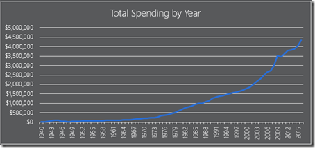
This chart allows you to see spending year over year. Look at the last 10 years and you can really begin to see the spike in spending. The neat thing about our analytics in Excel, is you have the ability to filter the data by President, Time in Office and Party.
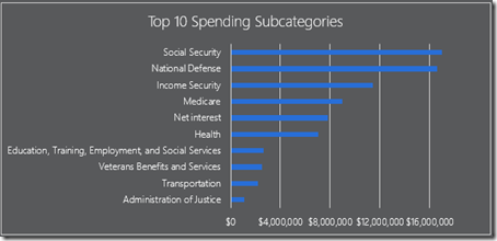
When you look at the top 10 spending categories, you can see that entitlements are really the bulk of spending. Sure, national defense is in there, but entitlements grow the fastest year over year.
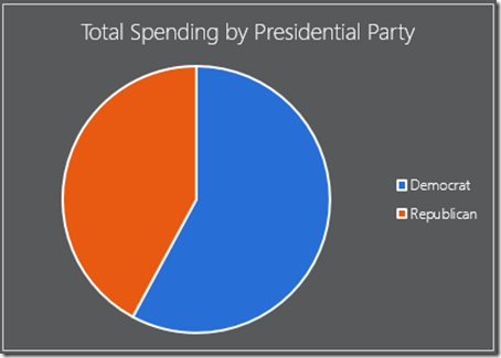
One of my favorites is to see spending by Presidential parties. You can see 2/3 of the entitlement spending is done by Democratic leadership, rather than Republican. That is a pretty interesting fact that I didn’t know before. See, some brand new insights we all didn’t know.
If you have some interesting examples you would like to share, contact me and tell me about it.
Enjoy, Patrick