With the launch of Microsoft Office 365, we felt we needed to update a previous blog entry and show off some new stuff. A while ago, we posted about the Powerball lottery when it was up to several hundred million dollars. It was really interesting to see the amount of traffic driven to our blog, as we showed how you could mash-up some data using Microsoft Excel and PowerPivot. It was a quick example and probably not our best work.

Recently, I had a young smart financial person in the office for an interview. I decided to give him a test to see what he could do with the tools. He was coming from an equity finance position into the technology consulting world. Well, I was impressed.

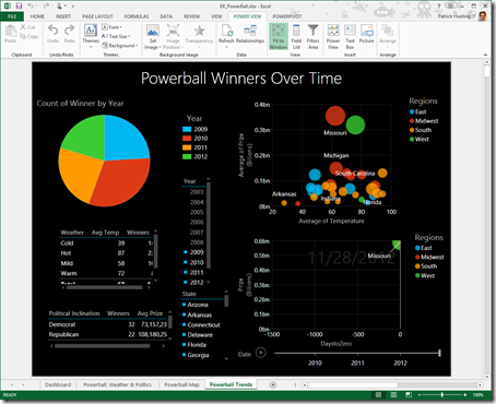
After he got all the data mashed up from the Powerball site, he created great looking Power View. It is all interactive and you have the ability to slice and filter the data. But wait! There’s more!

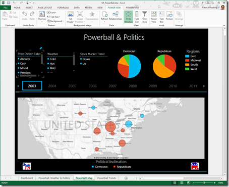
Then, using GEO, he was able to plot the winners based on their voting records and winning year! Ok, that is just crazy, but still kind of cool.

Then he just went nuts. He produced analytics on the weather for the days those drawings were won, where the winners were located throughout the country and more. Just fantastic.
And best of all, he spent just a few hours doing it. That is some pretty solid analytical skill he has, utilizing Microsoft Excel 2013 with PowerPivot and Power View functionality.
If you would like to get a copy of the spreadsheet, please contact us.
